
Brand & Web
Quore
Building the credibility of a luxury brand before the product exists.
Context
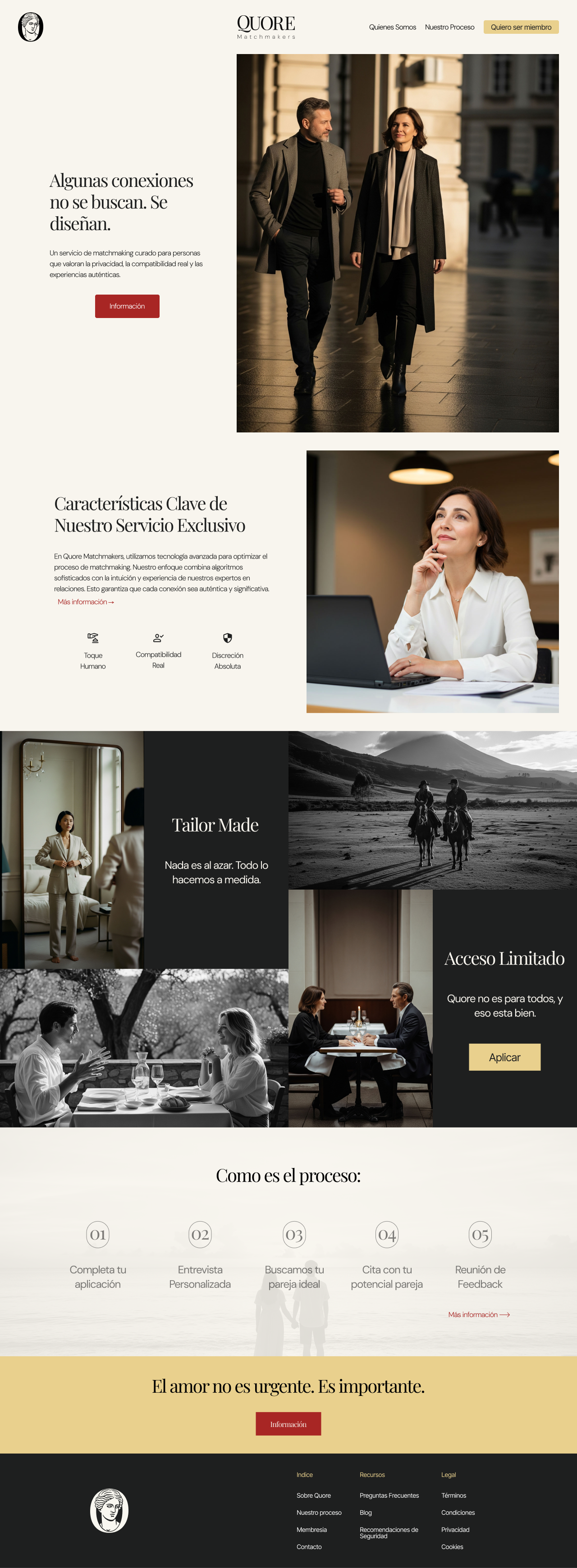
Quore is a premium, human-curated matchmaking service for people seeking something more serious than a conventional dating app. The design problem wasn’t about interface, it was about credibility. With no track record, no users, and no results to point to, the brand had to communicate “this is serious, exclusive, and trustworthy” from the very first visual contact.
Before designing a single screen, there was a harder question to answer: what actually sets this apart from a dating app with better photography?
Process / My Role
I started with strategy, not visual design. I defined the brand archetype (“The Lover”: connections built with intention and emotion, not transactions) along with the purpose, mission, and vision that would carry every visual and verbal decision that followed. I commissioned and managed the market research that validated positioning and target audience before committing any design resources.
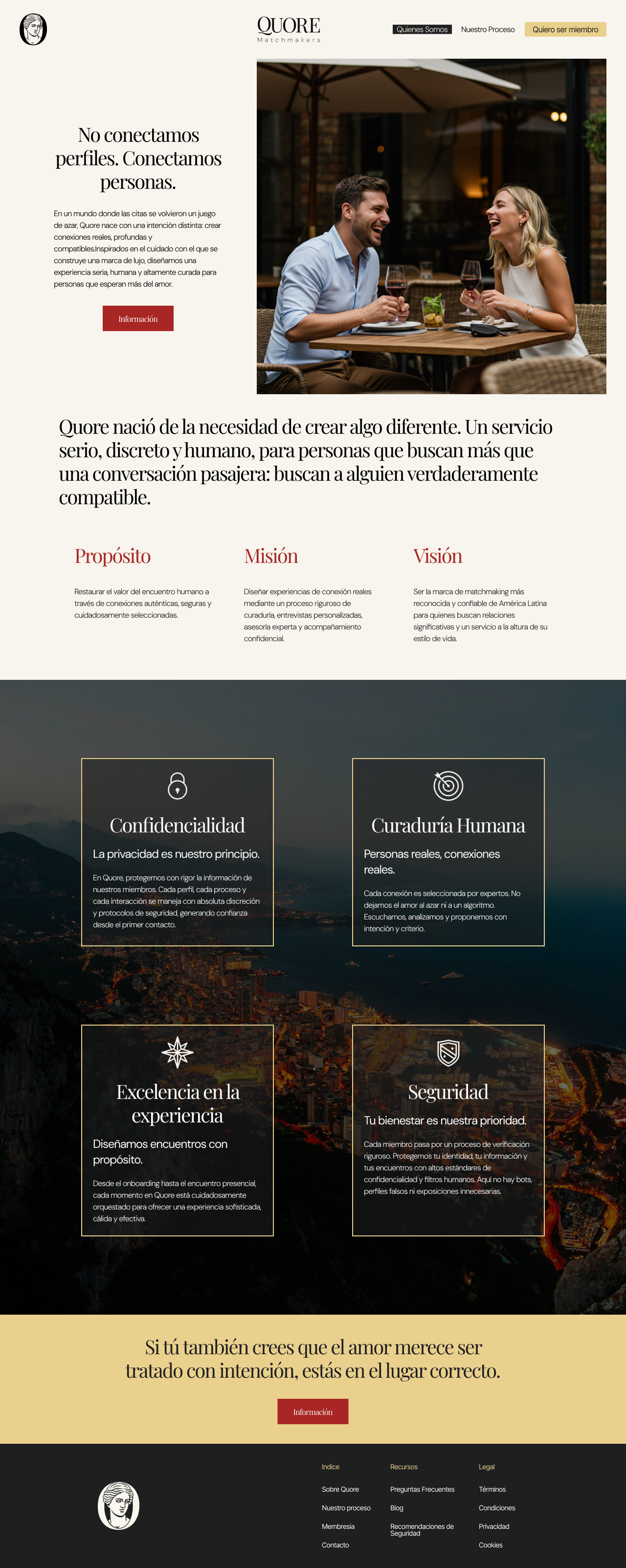
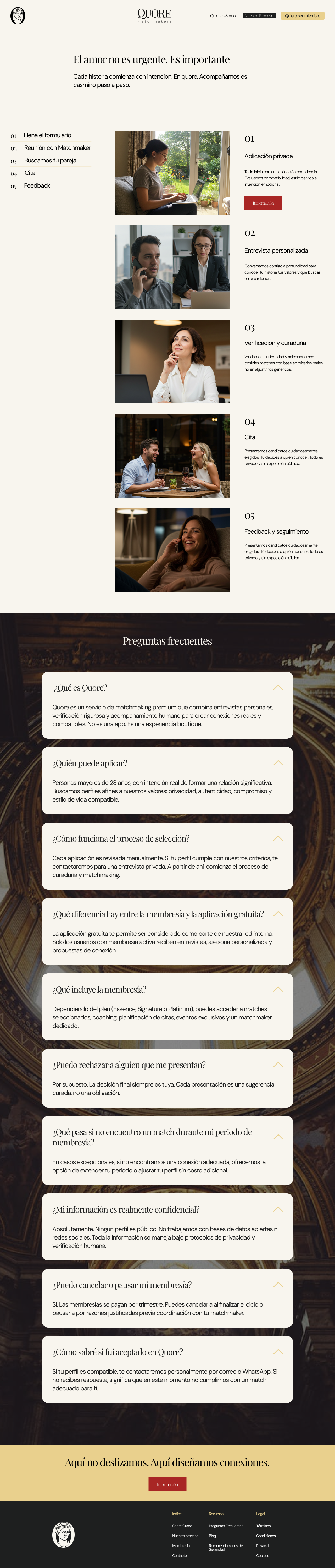
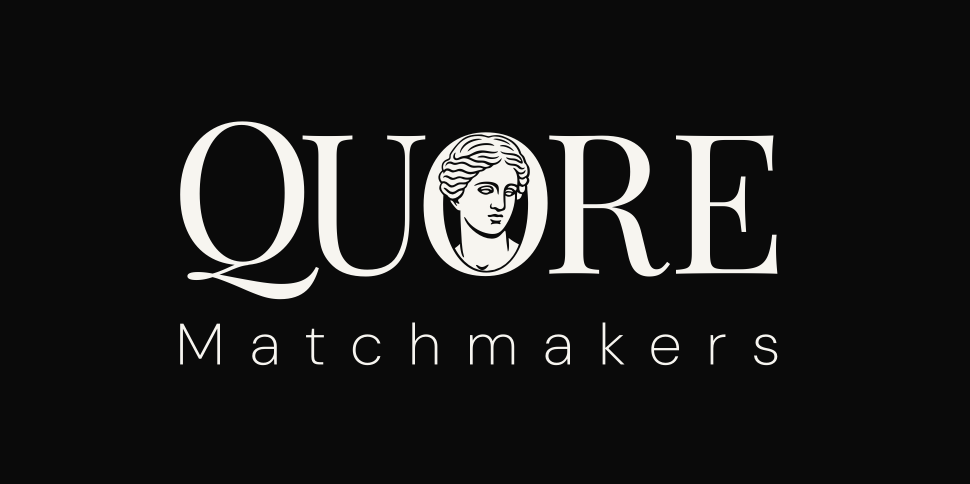
With that foundation in place, I built the complete brand system (logo, color, typography) and designed the website end to end. The rule governing every decision: avoid the visual and verbal language typical of dating apps entirely. No swipes, no “matches,” no urgency. Instead, an editorial, unhurried tone (“Love isn’t urgent. It’s important.”) and photography that feels closer to a lifestyle magazine than an app.
The Work
Website
Brand System
"[The Lover]. We create connections with intention and emotion." The archetype isn't brand-manual decoration, it's the filter that ruled out every design option that read as a dating app.
Brand System
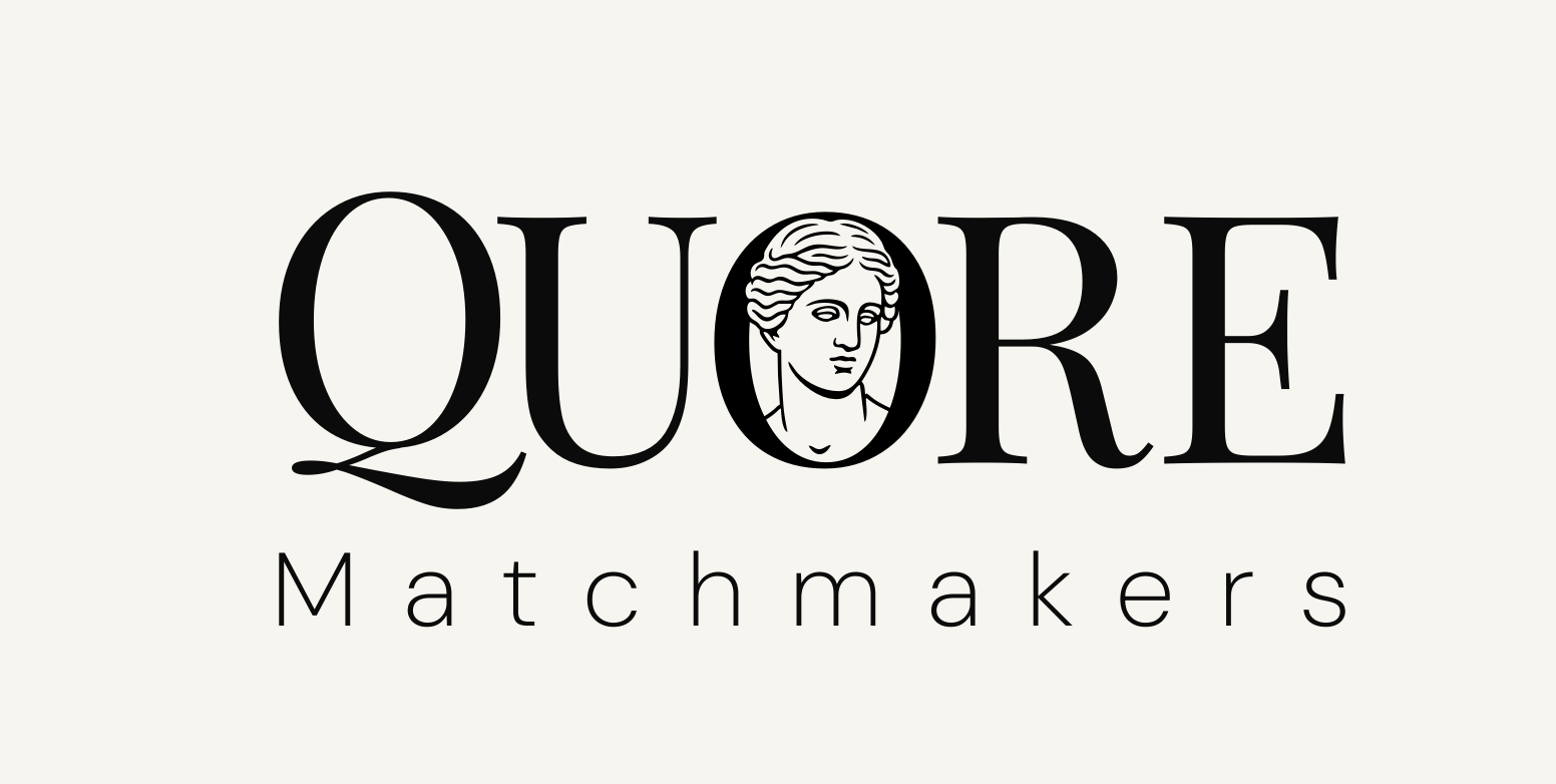
A neutral palette paired with an editorial serif and a geometric sans, built to hold the "quiet luxury" tone across any application, from the website to future print materials.
Palette
Typography
[The Lover]
We create connections with intention and emotion.
The Result
Though the service is still pre-launch, Quore already has a brand identity that matches its ambition. The project took an abstract concept (luxury matchmaking) and turned it into a clear, aspirational experience that balances trust, intimacy, and sophistication. For a brand with no prior reputation, this laid the foundation of credibility and desire before a single user could confirm it.
The Lesson
When there's no product or user base to validate an idea, the brand isn't decoration, it's the only evidence people have to decide whether to trust it. Designing Quore meant treating every word and visual decision as part of that evidence, not as aesthetics separate from strategy.