
Other work
Social Media
Brands without a clear identity or guidelines, turned into coherent visual and content systems for social media.
Context
Since 2015 I’ve worked as a freelance consultant helping brands solve a problem that comes up again and again: they have a presence on social media, but no defined identity behind it. They post content without a clear visual system, without tone or voice guidelines, and without a brand vision that gives their posts any real direction.
This shows up both in new brands just starting to build a digital presence, and in established businesses that grew without ever thinking about identity (clients like Lexis, Litigant, and Tiendablau, among others, came to me at different stages of this same problem).
The challenge isn’t just “making nice-looking content.” It’s building an identity system (visual and content-wise) the brand can carry forward on its own, without depending on me for every new piece.
Process / My Role
With every client, I start with an in-depth conversation to understand the brand: who they are, what they sell, how they see themselves. From that conversation, we build a brief together that turns loose ideas into something concrete.
With the brief as a foundation, I research the market, the product, and the competition before proposing anything visual. That leads to a brand manual built specifically for social media (not a generic corporate brand guide), where the visual system and content tone are defined together, not separately.
Depending on the scope, I either hand off the manual for the client’s team to run with, or stay on to produce the content myself. I work solo, though I bring in other professionals (photographers, community managers) when a project calls for it.
The Work
Lexis
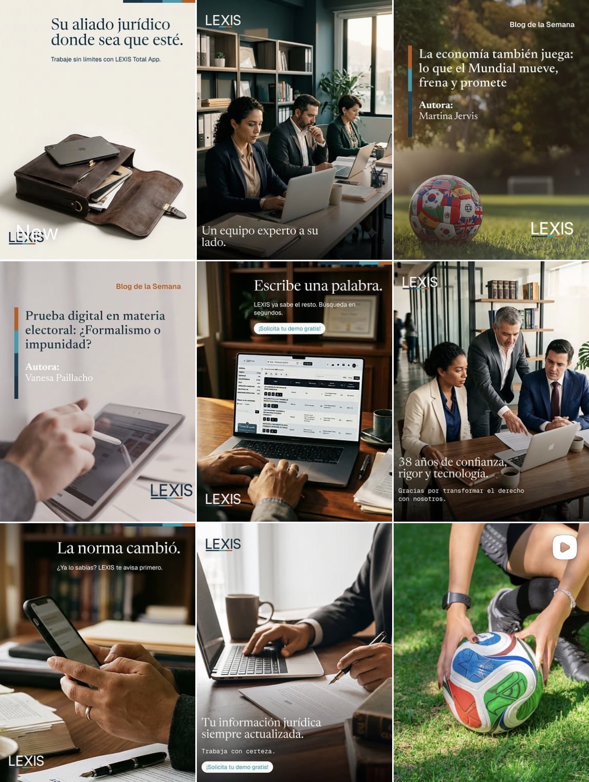
Lexis is a law firm with 38 years in business, but its social presence didn't reflect that weight. The challenge was building a feed that felt solid and trustworthy without falling into the stiffness so common in legal branding.
The system was built on deep blues, soft earth tones, and a serif typeface for headlines that gives every piece an editorial feel, paired with real office photography (not generic stock) to keep it authentic.
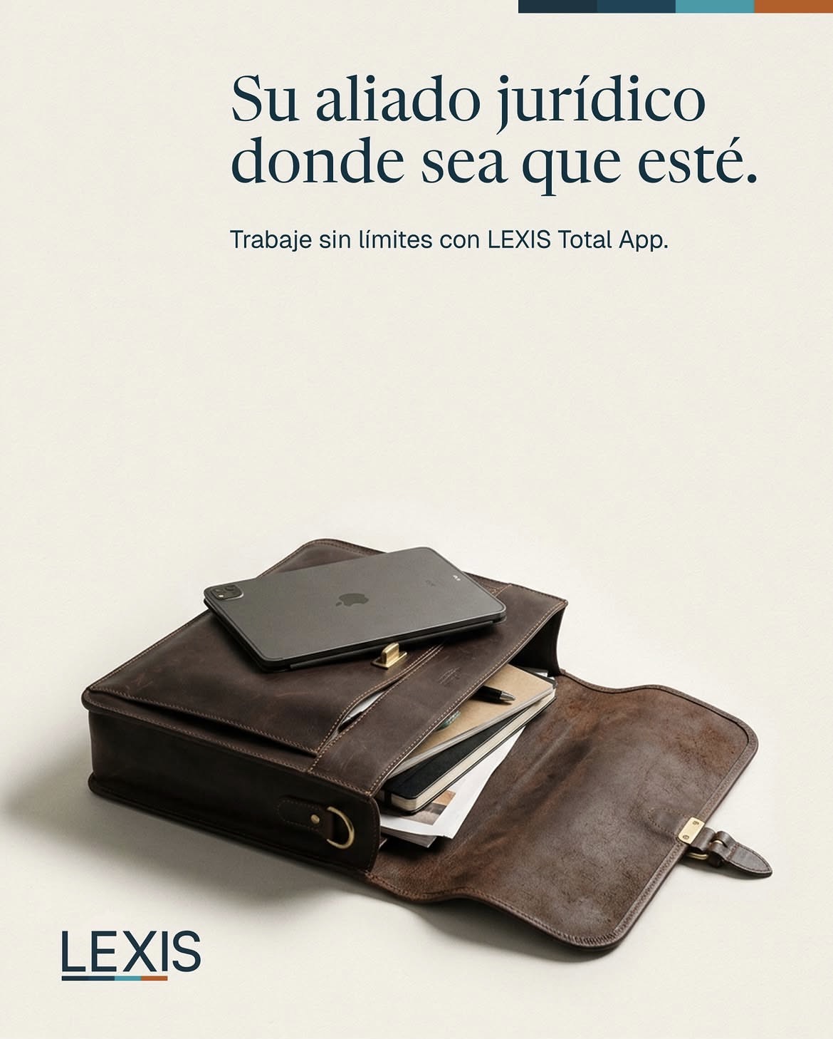
Pieces like the leather briefcase post with the line "Your legal ally, wherever you are" show how the system flexes across formats, from product launches to institutional content. That consistency holds even in commemorative pieces, like the one marking the firm's 38th anniversary, where the tone warms up without losing the brand's underlying seriousness.

Litigant
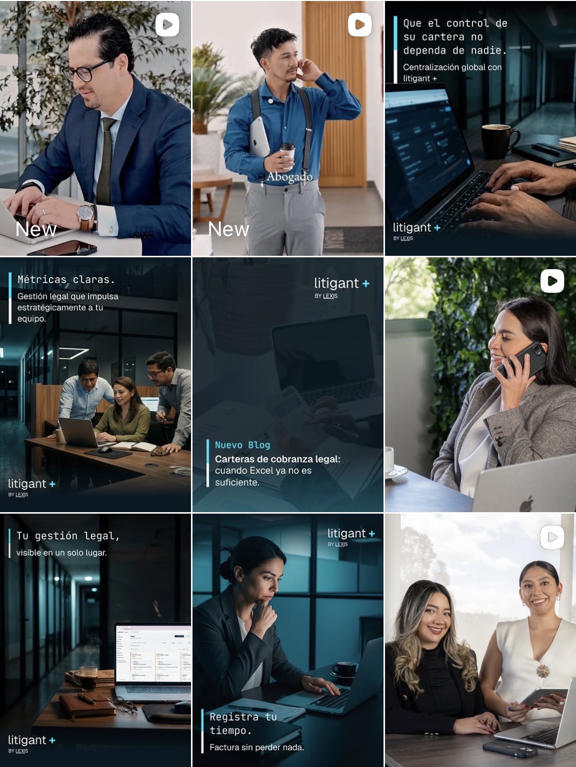
Litigant+ launched as Lexis's software arm, a legal management tool. The challenge here was different from the parent brand: it needed to feel tech-forward and agile, without cutting ties with the credibility Lexis already brought to the table.
The solution was a darker, more contemporary visual system, with monospaced typography for headlines (a direct nod to the software world) and electric blue accents over near-black backgrounds, deliberately contrasting with Lexis's warmer palette.
The content focuses on solving concrete user problems, "track your time," "bill without losing a minute," instead of talking about the brand in the abstract. That same logic carries into more institutional pieces, where the message shifts from a specific feature to the bigger promise of strategic management, without losing the product's visual language.


Tiendablau
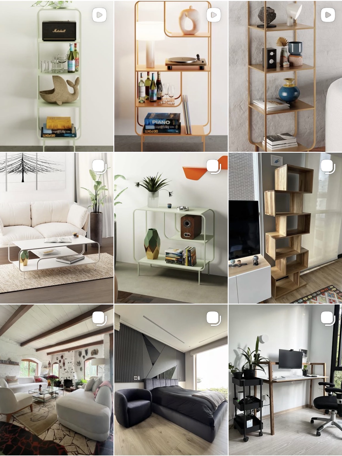
Custom furniture, and the identity challenge was specific: visually represent the combination of wood's warmth with metal's modernity, without the system feeling cold or generic within the home decor space.
The solution was a feed that mixes product renders in soft colors (sage green, ochre, terracotta) with real photography of pieces installed in clients' homes, showing that "custom-made" isn't just a catalog concept.
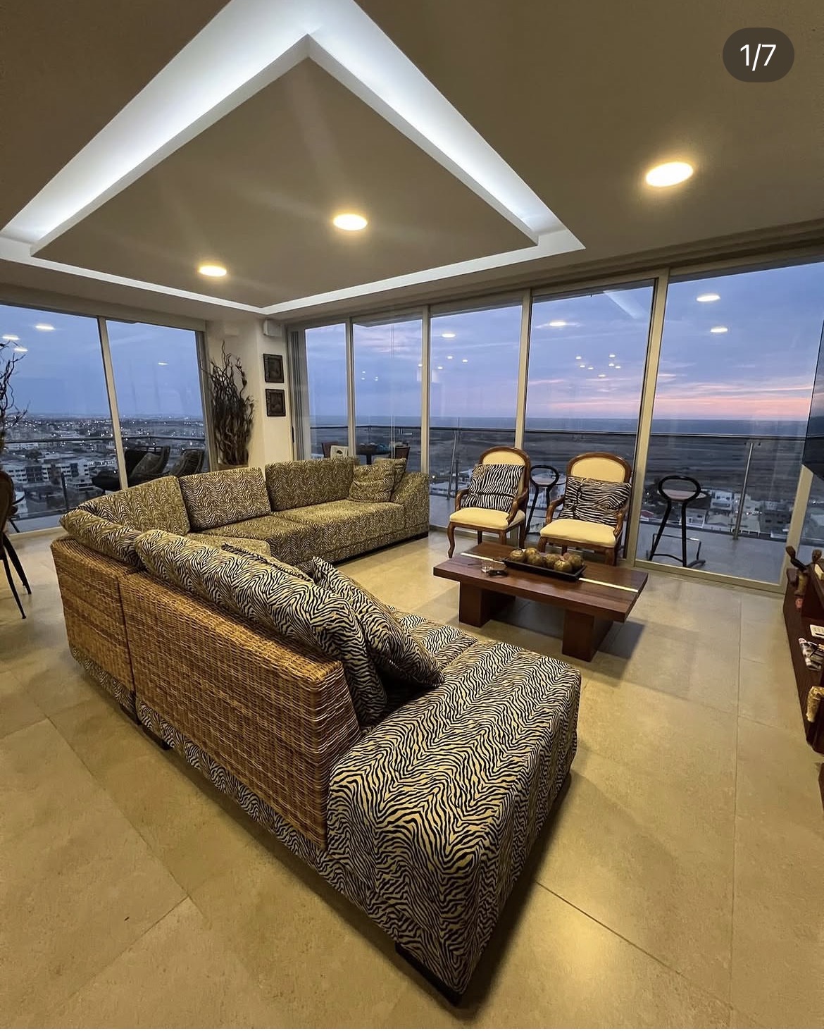
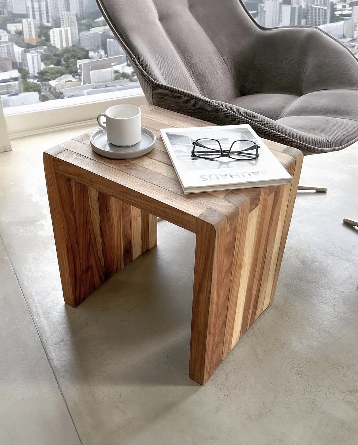
Pieces like the living room with the zebra-print sofa, shot directly in the client's home, reinforce the idea that every piece of furniture adapts to the client's style, not the other way around. That same balance between warmth and modernity shows up in the solid wood side table next to a contemporary chair, where both materials coexist without competing.
The Result
Giving a brand a clear image and identity where there wasn't one translates directly into results: content that amplifies what the brand already is, instead of working against it. Lexis, Litigant, and Tiendablau are examples of brands that now have a visual and content system they can sustain over time.
The Lesson
No two brands are alike, and that's the richest part of the process. Every new project means starting from zero in exploration and discovery, there's no formula that repeats from client to client.